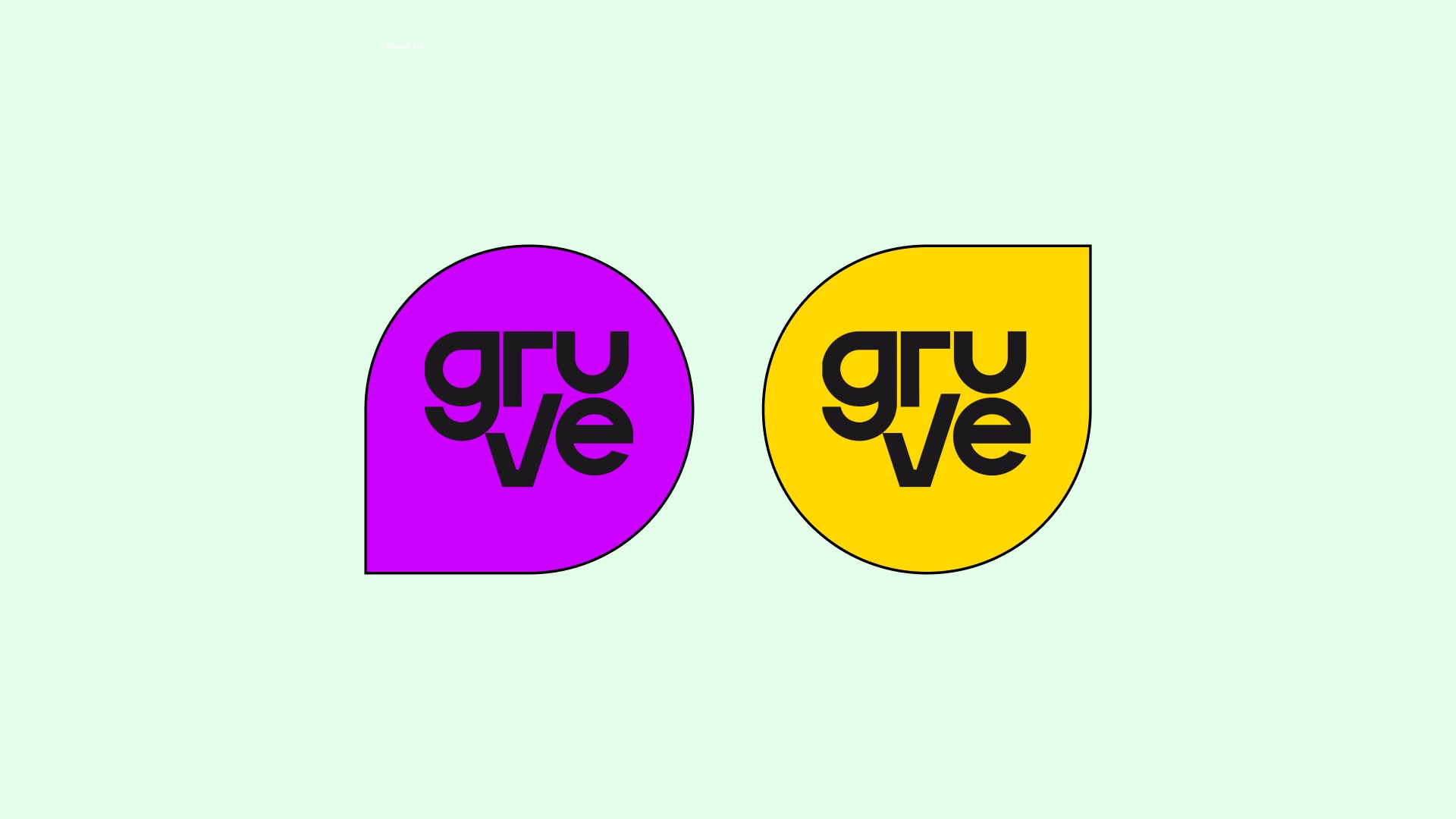
Taking a web3 based event ticketing platform out of it's shell.
Working on Gruve's brand redesign was an exciting journey of transformation. Gruve, a web3-powered ticketing company, sought to break free from the conventional and embrace a bolder identity that reflects its innovative spirit. The challenge was to create a brand that stood out in the highly competitive digital landscape, while resonating with a dynamic and fun-loving audience. With an ambition to move away from the mundane and into a more daring, unapologetic space, the brand needed to communicate transparency, excitement, and a sense of adventure—all critical elements in the world of decentralized ticketing.
Project Team
Creative Direction - Ameji
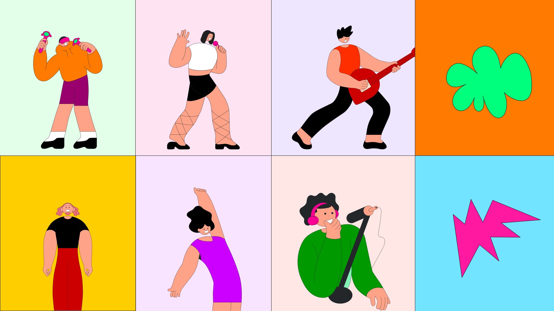
Illustration - Sash

Bold Choices: Colors, Typefaces, and Patterns
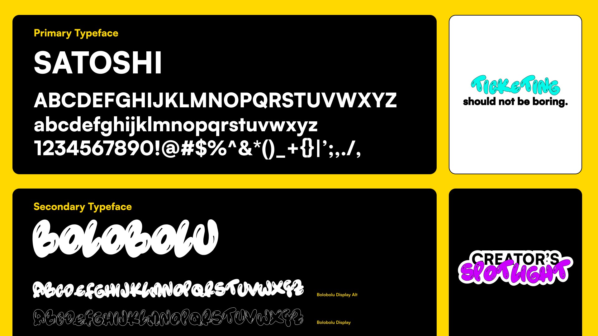
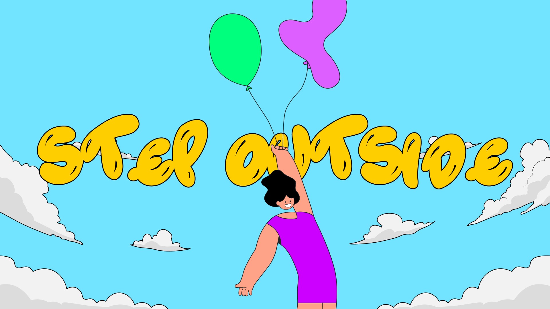
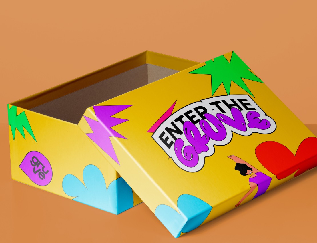
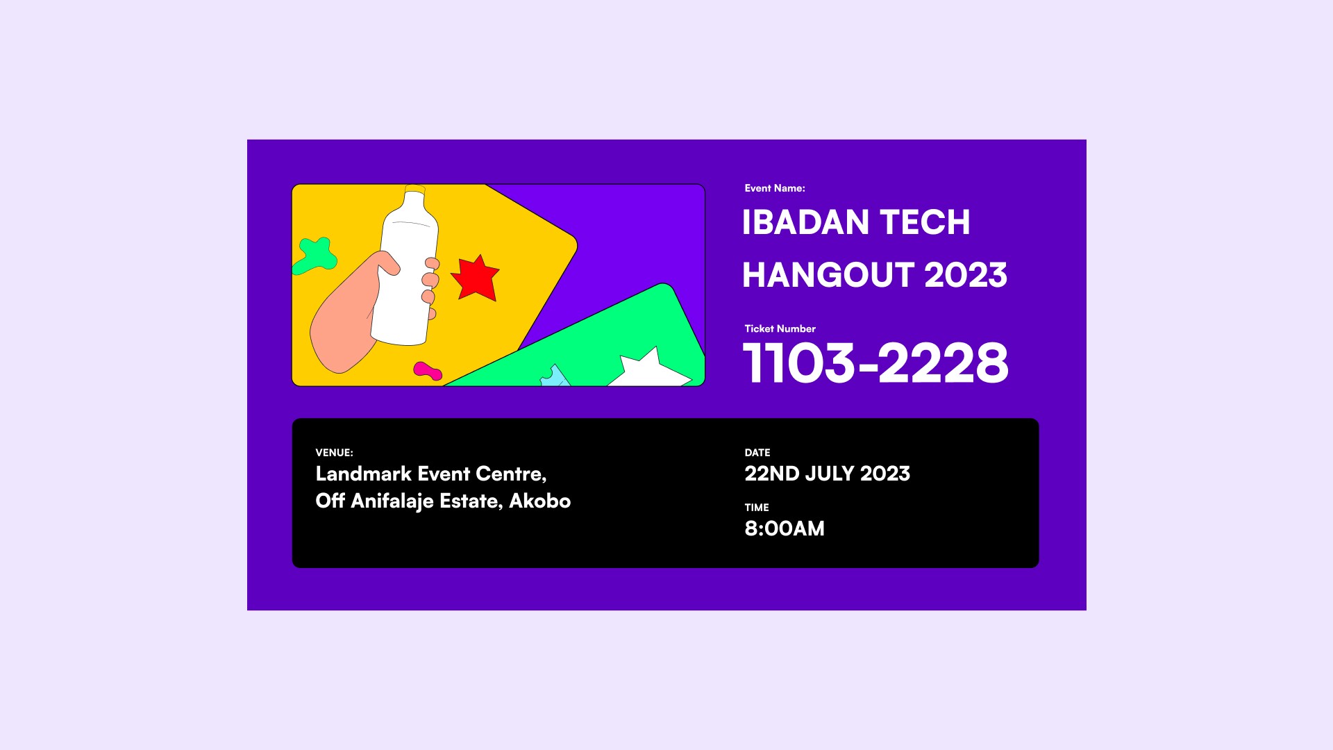
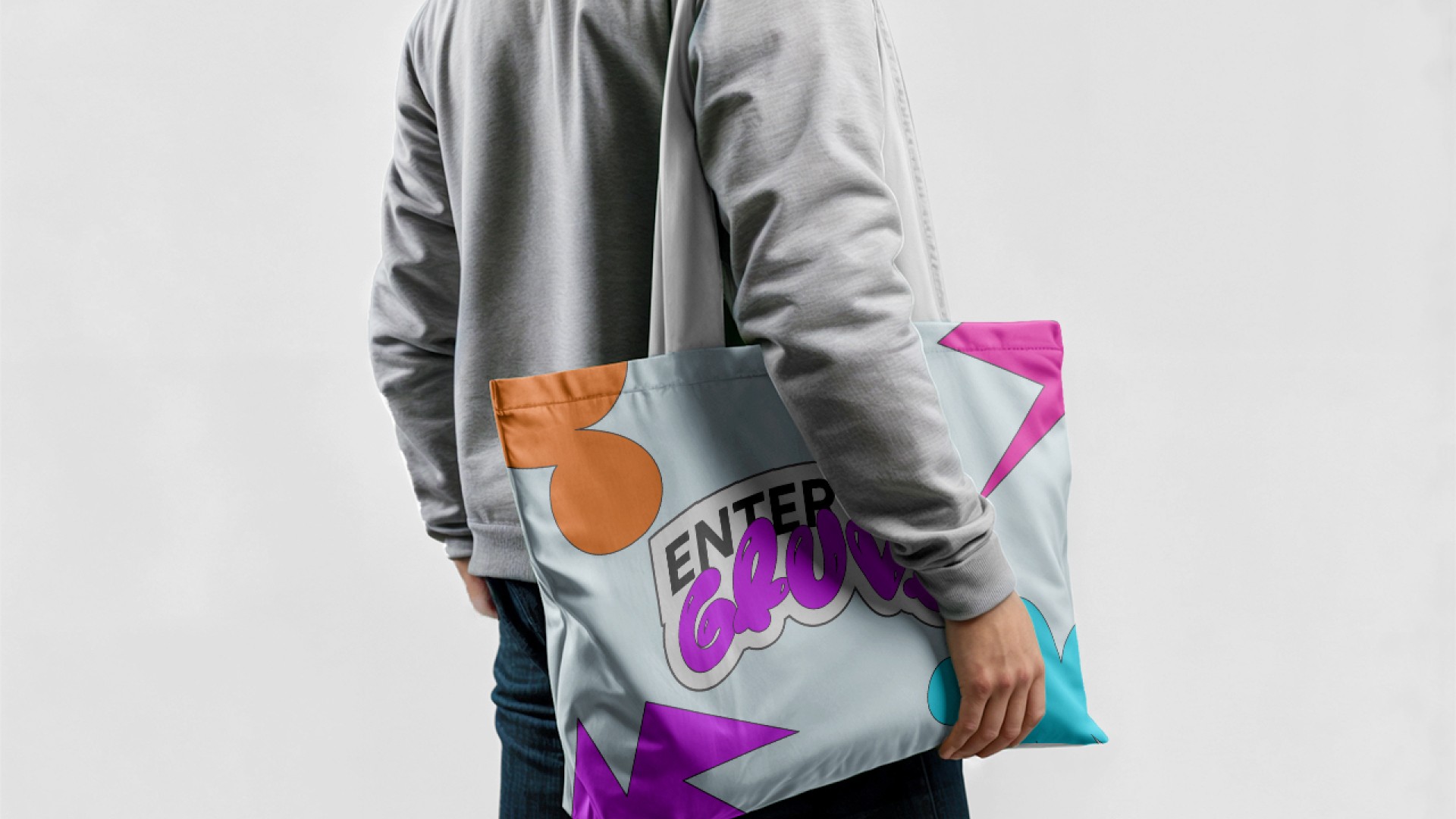
The creative approach centered around pushing boundaries by using bold colors that typically wouldn't harmonize but, in this case, came together to create a visual impact. Gruve's palette, led by vibrant reds and mustard yellows, infused energy and a rebellious spirit into the design. Pairing these hues with the contrast of a serious typeface like Satoshi for body text and the quirky Bolobolu for headlines established a playful yet professional tone. This unexpected combination gave the brand an edge, allowing it to oscillate between fun and reliability. Colorful patterns and layered textures were introduced to add depth and excitement to visual elements, ensuring that Gruve felt vibrant and alive, while not losing focus on usability and accessibility.



Impact and Success
As the new brand identity rolled out, Gruve quickly began to live up to its name, garnering attention for its distinct, energetic look. The bold design choices communicated confidence, breaking away from traditional ticketing norms and positioning Gruve as a standout in the web3 space. Clients and users alike resonated with the brand’s playful yet trustworthy personality, creating a ripple effect where "stepping outside" wasn't just a tagline, but an experience.

