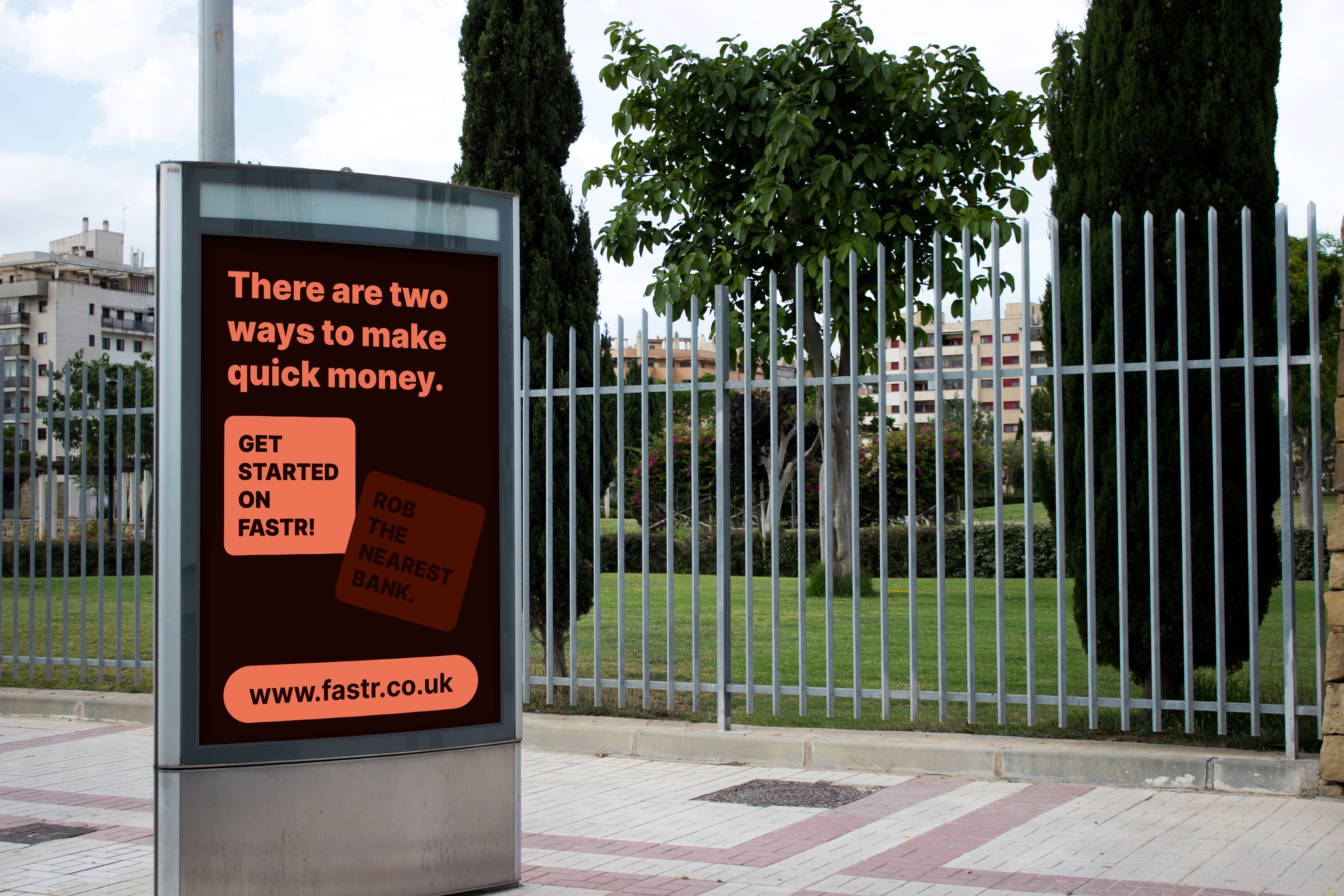
Creating flexibility between professionalism and friendliness.
The hospitality and event staffing industry is an old mans barnyard where it takes grit, experience, connection and a willing workforce to make a difference. So when the founders of "Find A Shift Today Recruitment" approached me to create a brand system that could make them stand out to the young audience they want to appeal to, It was an interesting journey to not only create a "good looking" visual system but also to help the company figure out who they are, who are going to be their major users and also why should these people actually listen to them or even consider them ahead of already existing and giant competitors in the industry.
Project Team
Brand Strategy - Ameji
Visual Identity Design - Ameji
Motion Design - Ameji
Illustration Design - Ameji
Iconography - Ibrahim Otukoya
The problem with trying to be "fun" in a serious industry.
The challenge with the project didn't just begin with the visual system but also we needed to answer the questions:
"How do we make ourselves look and sound cool?".
"How do we not come off as unserious to our hiring companies?".
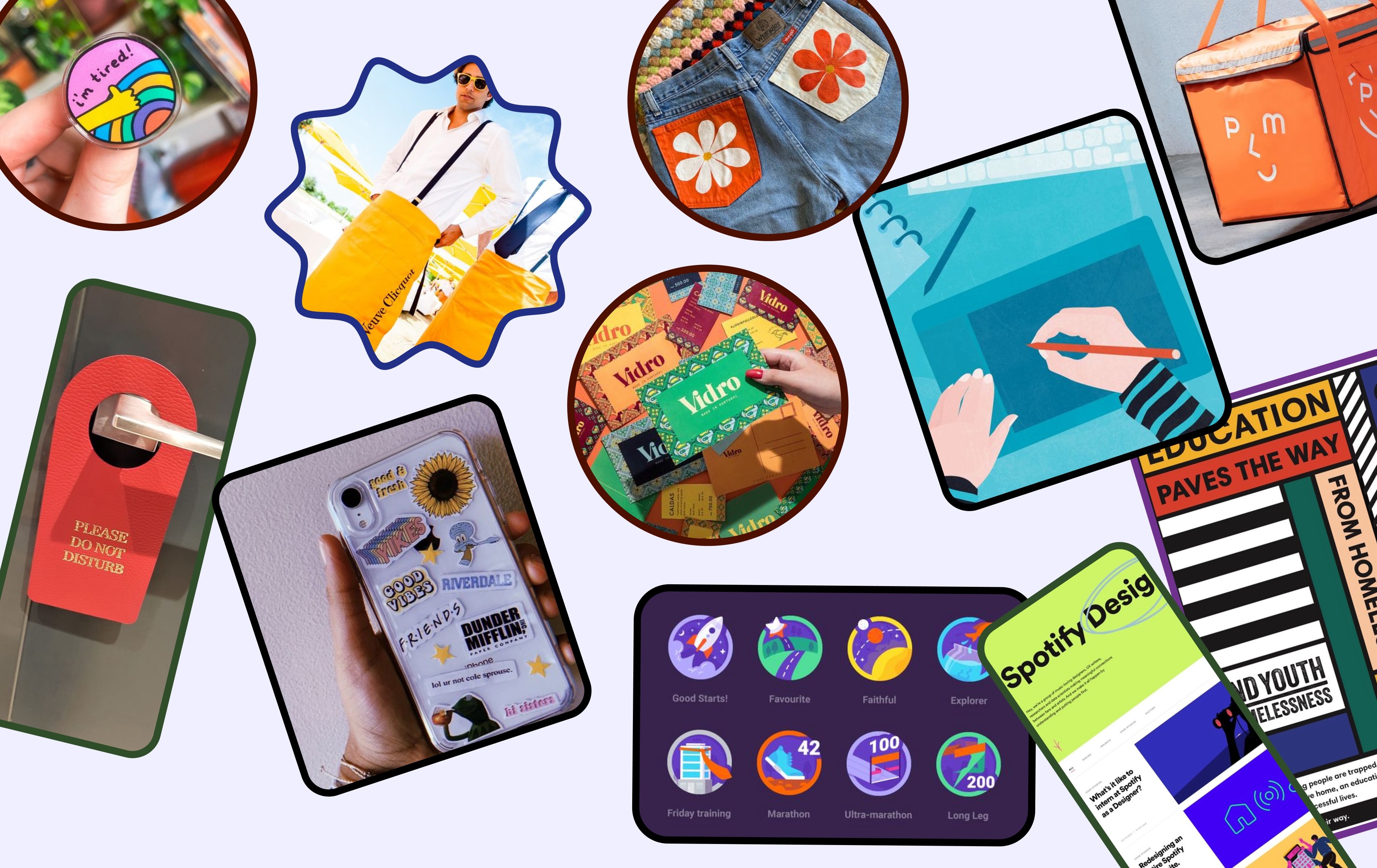
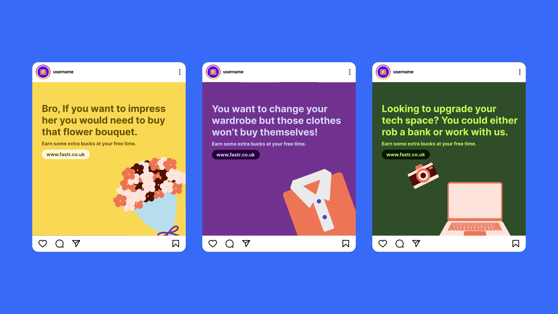
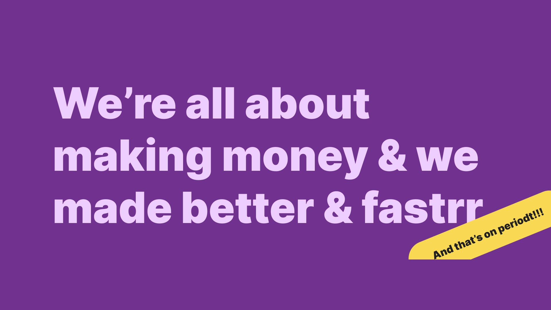
Our approach began with a brand strategy session focused on university students, followed by developing a unique name and visual system. The visual language we created balanced professionalism with friendliness, using simple curved edges to avoid both boring rigidity and excessive playfulness. This careful balance allowed for quick transitions between friendly and professional tones, setting the foundation for a versatile brand identity that could resonate with both target audiences.





Project Summary & Impact
The project was a resounding success. The resulting brand system not only looked unique but also established a strong connection with the target audience. It resonated particularly well with students, leading to an overwhelming number of sign-ups on the waitlist before the product launch. The deliverables included a brand messaging guide, go-to-market strategy, brand name, logo, supporting visual system, illustration system, and a kick-off marketing campaign targeted at university students.
